In a Nutshell: U.S. stocks’ price action continues to diverge from their fundamentals. Safe haven investments continue to consolidate constructively.
Domestic Equity: Stocks Shrug Off Earnings Recession
Stocks continue to grind higher, while smaller companies have finally started demonstrating constructive price action. Below, we see a chart of small cap companies that are still well below their 2018 highs, but are making new 52-week high marks. The top blue line will be an important one to watch. If prices remain above this level, it would be very productive for the broader market. Below that line, the frustrating sideways march will likely continue.
The price action in stocks seems to be diverging from fundamentals, as Factset is reporting negative earnings growth for the third straight quarter for S&P 500 companies. To be classified as an earnings recession, back-to-back quarters of negative growth must happen. We’ve now witnessed three straight negative quarters and Factset is projecting for negative earnings growth for the fourth quarter in 2019.
Why the disconnect with stocks? Look no further than the Federal Reserve. Although the Federal Reserve is currently projected to keep interest rates steady in December after three successive rate cuts, they are expected to continue to fund the repo markets into 2020. This Fed balance sheet expansion is currently growing at a pace not seen since 2008.
Global Equity: The Pause After the Breakout
Last month saw developed markets break out of a nearly year-long consolidation. The small, horizontal line represents the threshold crossed to signify the breakout. This same line should act as support if this breakout is substantial. Additionally, with the European Central Bank dead set on continuing monetary stimulus, warranted or not, developed markets should continue to rise.
Real Estate: Holding the Line
Last month we expressed concern regarding real estate’s staying power as a top performing sector because of the short-term “melt up” it was going through. However, for now, real estate has held its longer term trendline. Below, you can see how the light green trend line was violated, but the longer term blue line has held. A break down of the blue trend line will mean either investors are dumping defensive positions like real estate for higher risk investments or the broader market is pulling back.
Commodities: The Dollar Weakens, Gold Ready for Another Run?
One of the top performing commodities this year has been gold. Gold broke out of a very long-term base this year and went on a tear. For the last few months, the yellow metal has been consolidating in a slightly downward pattern. Countertrend patterns are quite common within the context of a broader trend. In fact, you can see below a nearly identical pattern took place earlier this year and resolved to the upside. If we see upward resolution from our current consolidation like we did earlier this year, gold has huge upside.
A potential accelerant for gold would be a weakening U.S. Dollar. Though the dollar has been steady as a rock for nearly two years, we may be witnessing a regime change. The upward trend line is holding, but we haven’t seen a new high in a few months, while momentum (top chart) has been falling. It is no accident that the peak in the dollar we saw last September coincided with the Federal Reserve having to intervene (by printing money) with repurchase markets. This Fed intervention has been ongoing since then and is expected to continue through the first quarter of next year. Though the dollar still looks strong compared to other world currencies, it appears that the Fed’s actions are working to devalue the dollar.
Fixed Income: The Bond Rally Might Have Life After All
Last month we discussed how the bond rally may be coming to an end. However, bonds have shown incredible resilience despite recent equity strength. Additionally, the more price data we collect, the more this current consolidation looks like a “bull flag,” meaning a counter trend movement that should ultimately resolve to the upside. It is no surprise we see a similar pattern with gold above as gold and bonds are both safe havens for investors.
Below is a follow-up on our conversation on yield curves from last month. This chart is one of the biggest reasons our optimism remains muted. The boxes below indicate when the yield curve has inverted over the last two decades. Each time it has preceded large bear markets – in fact, this same indicator was triggered prior to the last seven recessions. This indicator is not a great timing mechanism, but can provide context as to where we are in the credit cycle. 2000 was an exception, but generally the stock market damage is done after the yield curve becomes uninverted. You can see this on display in the 2007 scenario as the market peaked just after becoming uninverted. In our current situation, we are now in the univerted stage after inversion. So we are either approaching a market top in the very near future, or – and this is possible – the indicator just threw its first false flag in a half century.
All Terrain Portfolio Update
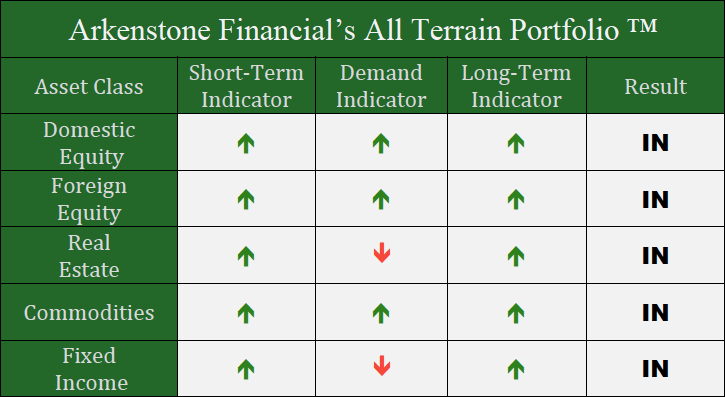
We’ve kept our positioning stable in the All Terrain Portfolio from last month. As our indicators dictate, we will add or subtract to these positions in the coming months. We will continue to monitor our indicators for more clarity.

Past performance is not indicative of future results. Other asset classes or investment vehicles may be used in client portfolios and client portfolios may not hold all positions of the model at the same time as the model. This chart and its representations are only for use in correlation to the proprietary timing model by Arkenstone Financial, Registered Investment Advisor. Actual client and All Terrain Portfolio(TM) positions may differ from this representation.
- U.S. Stocks Make New Highs - December 6, 2024
- Rising Rates Create Headwinds - November 8, 2024
- The Fed Finally Cuts Rates - October 10, 2024


Leave a Reply